About Us
How It Works
Pricing
Poll Gallery
Login
|
Register
New Poll
New Poll
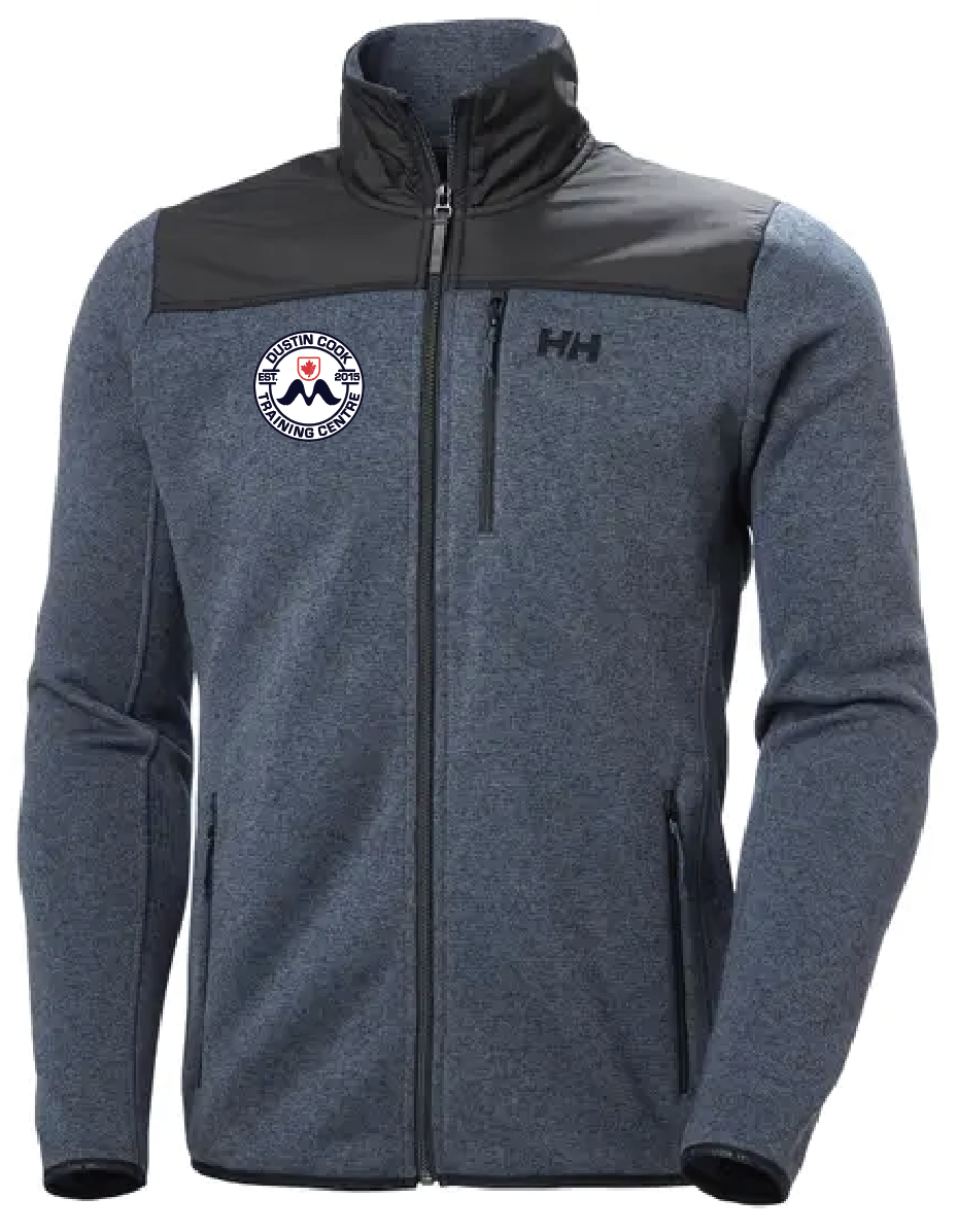
Question:
Which M logo colour do you prefer? One is transparent and the other has a white background.
People
50
Choice Option
2
Audience
General
Status
Completed
Location
UNITED STATES
Download
Share
Winner
Option A
68 %
Option B
32 %
Responses
Showing 50/50 responses
Male
Female
All Filters
Gender (Personal)
Male (28)
Female (22)
Age Range (Personal)
18-24 (5)
25-34 (21)
35-44 (17)
45-54 (3)
55-64 (4)
65-74 (0)
Public
21 Oct 2020
34 Responses to Option A
34 people chose A as their choice
1.
nice
2.
The option 1 logo is not too bright so it doesn't catch much attention as the option 2.
3.
good look
4.
I like this one
6.
the transparent logo looks best and matches with the fabric better because it is more subdued
7.
its really amazing
8.
very lightly
10.
The first option's logo blends in well with the rest of the fabric. White logo makes it look cheap.
11.
The logo was quite good and visible
12.
I THINK ITS OPION 1 ITS M LOGO
13.
ITS NICE
17.
I feel like it blend better and looks to be of higher quality.
19.
The one with the white background just stands out too much and looks a little cheap.
20.
I think it looks better when the logo is less prominent. The white background of the logo looks too obvious and also less elegant and slick.
21.
I would like to choose to option A because of the fitness
23.
good
24.
transparent blends in the background well. the white bg one looks a little bit odd...
25.
nice
26.
good
28.
It is less conspicuous
29.
Good looking wearing this cloth.
30.
good
34.
Option #2 is too bright
35.
option 1 has a more natural looking logo that doesn't stick out as much
39.
The transparent background looks a lot more professional and smooth with the color of the jacket
40.
LOOK GOOD
41.
better than option 2
42.
I like to have things more discreet like that.
43.
The Logo is clearly Visible and attractive
45.
transparent logo is nice
47.
the color around the logo for option 1 blends in better with the rest of the outfit
48.
very nice and attractive design logo
49.
Design very nice
50.
I think it blends into the clothing more and is less jarring to look at.
16 Responses to Option B
16 people chose B as their choice
5.
I think that the M on the logo stands out better with this font.
9.
It was very attractive look. The white color on the back shows the black M logo very nicely.
14.
good
15.
its good look dress that is nice
16.
it's more vibrant and visible
18.
design is more clearer and nice to look at
22.
This logo color gives more contrast to the jacket color. It is attracted more. Hence I choose it.
27.
its beautiful
31.
i like the logo on this one better it stands out and you can see the M better
32.
it was good to wear and aspects
33.
The white background offers room for attention
36.
It has more white.
37.
its look like awesome and branded
38.
I just thought the white background goes better with the design.
44.
because it was too stylish and looking good
46.
I like black color the logo is also in black color.
Demographics
Manage pending orders and track invoices.
Gender (Personal)
Age Range (Personal)
Share Your Results
×
Anyone with the following URL can see these poll results.
Copy